Design Systems: Atomic Approach for Scale & Consistency
Mid Level
・
5 min
Design Systems
Sustainable Design
Atomic Design
Table of Contents
In digital projects, Design Systems unify visual elements, ensuring speed and harmony. Atomic Design breaks everything into atoms, molecules, and organisms, so you can scale your product without losing brand identity. Wondering why every team raves about Figma libraries or “atoms”? Because it prevents “This button changed again?!” chaos. Let’s see how a design system + atomic approach offers sustainability and scalability in UI & UX.

What Are Design Systems?
Think of a restaurant constantly changing its menu layout every day—confusing, right? Design Systems prevent such chaos in digital design.
• Design Components: Buttons, cards, forms, tables stored in a central library.
• Style Guide: Colors, typography, icon sets reflecting consistent brand identity.
• Speed & Consistency: Instead of redesigning each page’s button, you pull from a master library every time.

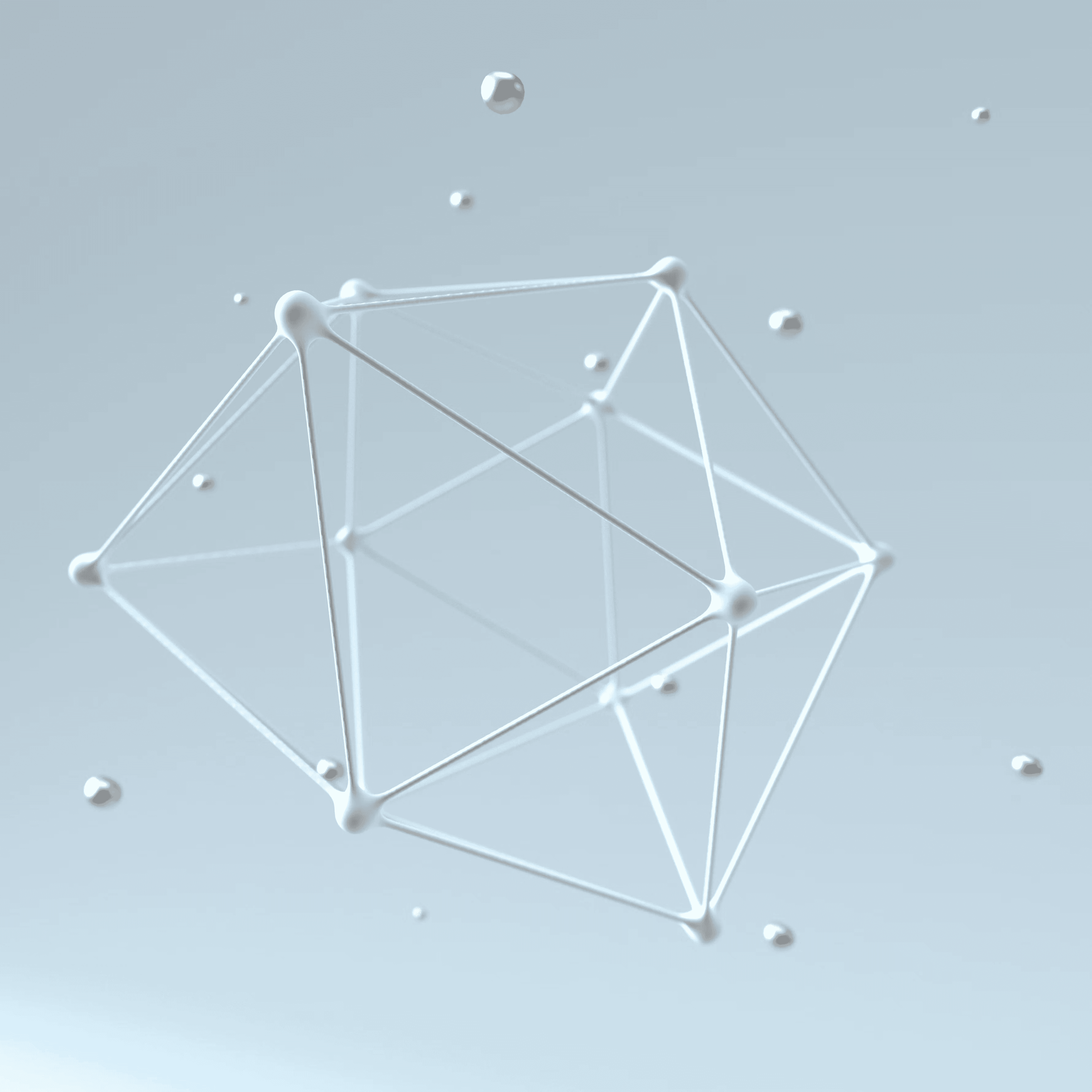
Atomic Design Basics
Atomic Design organizes your UI starting with tiny building blocks, scaling up to full pages.
• Atoms: Smallest elements (like a single button or input).
• Molecules: A group of atoms (search bar + button).
• Organisms: Larger sections combining molecules (header, hero).
• Unified Control: When atoms are defined, larger components remain consistent in style and function.
Sustainable & Scalable UI/UX
As your project grows, new features or pages can cause design headaches—unless you rely on a design system.
• Sustainability: Everyone uses the same “ingredients,” so you don’t lose brand coherence.
• Scalability: Jumping from 10 to 1,000 pages, your UI stays uniform; updates propagate automatically.
• Time Saver: New team members quickly pick existing components from the library, no guesswork.

Why Everyone’s Buzzing About Atomic Design?
Because rewriting everything from scratch is a nightmare. Atomic approach splits a big design puzzle into small, reusable pieces.
• Easy Maintenance: Change a single “atom” (like button color), and it reflects site-wide.
• Common Language: Designers and devs align their vocab with “atoms,” “molecules,” etc.
• Continuous Growth: Add new atoms or molecules as needed without blowing up the entire system.
Are there parts you don't understand? We can clear up your questions together or if you would like to contribute to this article, please email me at [email protected]
Stay Ahead in UX Design
Subscribe for free UX design tips, trends, and insights. Elevate your skills with fresh content delivered straight to your inbox!


Left a Comment
Comments
No comment yet.
